Hello folks,
I’m having some problems with OM on Windows 10 concerning the size of the fonts!
I do hope you can help, or consider this issue for the next release.
Neither unscaled, or scaled is providing to be a particularly workable solution for me.
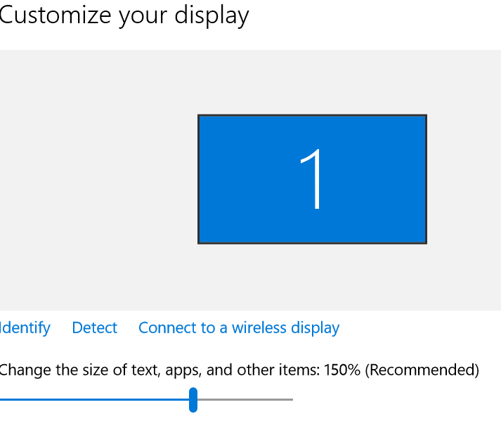
(I’m on a 14’ laptop at standard 1920x1080 HD resolution, not a fancy 4k monitor).
Problem 1.
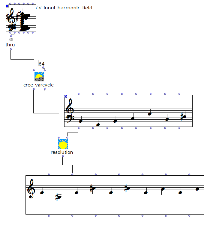
With HighDPI scaling turned off for OM, OM is super tiny. No surprise.
Yet some very strange things happen when a number of objects
are drawn! For example, chord-seq has very strange note-heads, and when opened, the bottom of chord-seq window
is overwritten by the menu selection boxes.
However, what is surprising is that the screen ‘real-estate’ looks mostly ok - ie, NOT super tiny - you
can get plenty of objects on the screen, and for the most part, unlike the fonts, they are readable (at least
to me, and my eyes are not the best). That’s in unscaled mode. It’s small, and perhaps a little too small,
but not that bad at this resolution. Yet the fonts are not working (see screenshots).
Problem 2.
With HighDPI scaling turned on, whilst everything is in proportion as it should be, fonts are super fuzzy (no surprise) -
but they are really not good at all to read - but more problematically, the size of the patch windows is disproportionally large (in my view).
Most patch elements appear to be disproportionately magnified and the screen size is not really made use of.
Any chance someone could look at the scaling of the various elements in Windows?
How about this for a solution - at least a temporary one, as I understand this can be a complex issue -
- Is there any way please we could user-specify the font and font size for the workspace text (not within patches or the listener,
but in the workspace) list of patches? If only this
was user-adjustable, then OM could be made to look mostly ok by running in ‘don’t scale’ and making the text bigger.
Just being able to correctly see the workspace list of patches would be an awesome step forwards.
OM itself runs very well on Windows 10. It’s fast, loads quickly, and works very well with my mac patches
with no issues. Great job.
Thanks very much for your assistance -
Ambrose
Attachments
- typical text render with default scaling enabled
- When DPI scaling is off, the fonts look like this! (Just being able to adjust them would make a difference)
- With DPI scaling off, the noteheads look like this! (Note though, how the patch is an appropriate size despite
some